FLYR:
A new brand and experience
An expansion of services deserves the growth of the brand.
FLYR, an AI-powered revenue management platform initially developed for airline optimization, expanded its offerings into the hotel and cargo industries.
This revolutionary product offering meant the original brand, messaging, and digital experiences needed a rewrite.
I was asked to lead the team through workshops, research, and visual design expression (brand and digital).
A foundational approach to the evolution.
To get at the heart of where FLYR was headed, it began with in-depth interviews with the founder and long-term employees to define the source of the inspiration. What was that initial kernel that started everyone on this journey?
Expanding into additional desk research and 3rd party surveys, we complemented the initial rounds of research with additional context as to how those expectations from customers had evolved and how FLYR could meet not only the original industry, airline, but how they would need to define communication to additional hospitality and cargo.
Remaining consistent across industry, but specific to each.
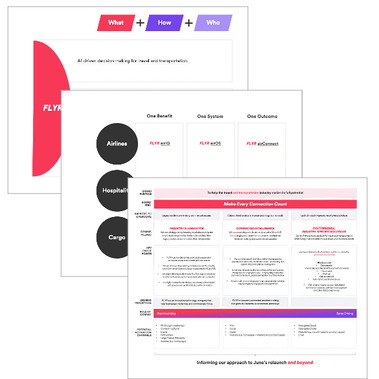

We clearly defined the brand purpose, leading to the brand idea. This served as our Northstar for all design and messaging activities throughout our engagement and for the internal marketing team to continue the brand expression.
Defining a new brand
To look ahead, we had to look at the existing environment.
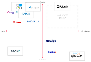
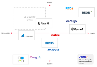
To give the visual design team an ideal brief it was necessary to survey the competition across not only revenue management systems, but also include leaders in the AI-technology space. Across the spectrum, we had aligned on 6 in each category to use the basis for comparison.
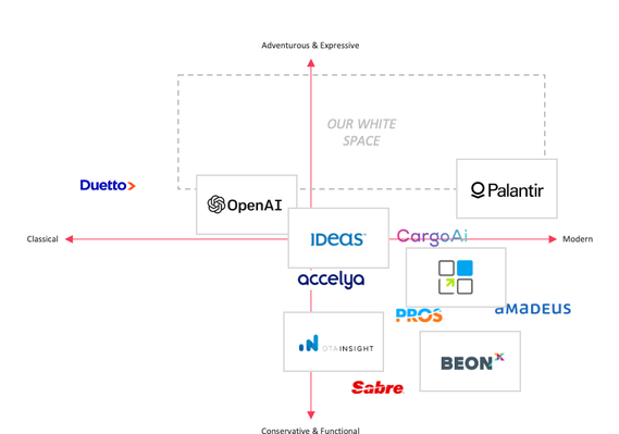
Knowing that we had limited time between CMO and CEO, it became key to cleanly and elegantly express complicated ideas. Across aspects of color, typography, and image, we collected all the data into easily-read graphs in an attempt to quantify the "whitespace" brands left open for FLYR to turn into their unique advantage.
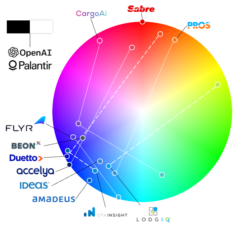
Beginning with color. Where can the brand express it's unique identity that isn't already crowded?
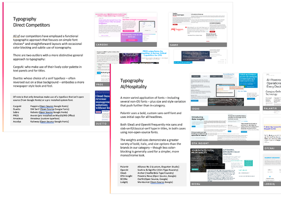
While the research for typography is dense, it's necessary...
...to clearly identify the area where the competitors aren't.
We repeated this process of exhaustive research and summarizing across other key foundational elements of brand:
Font selection.
Photography syle.
Iconography style.

And summarized into a single slide for CEO review and approval.
Building the brand.
Beginning a refreshed logo.
The identification and organizational approval of whitespace allowed for the ease of crafting a concise brief setting up the parameters for success in the eyes of the founder, the CEO, and the CMO.
Several internal rounds of development were executed across two different design teams, leading to an exciting array of options to begin sharing with the client.
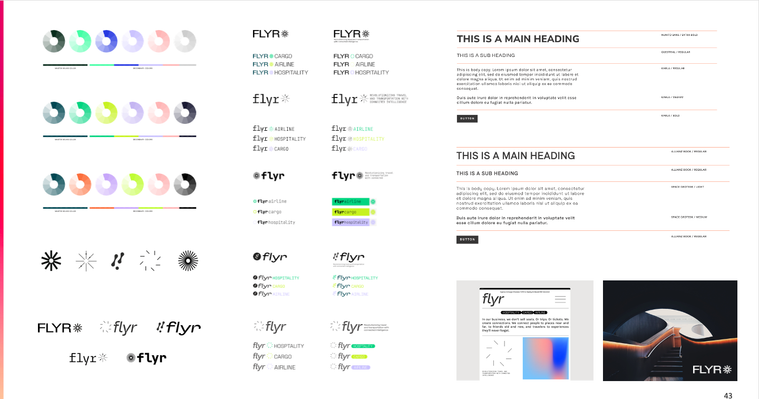
The final logo inherited the spirit of the original, while moving it into the 21st century leaning into AI and creating a new visual language represented within the logo (called "metaballs") that expresses the connections FLYR makes across disparate teams at organizations to fully revolutionize revenue streams.
Launching the digital experiences
With a new logo and visual identity defined, we then moved on to ensure its digital alignment. Providing the clarity of the brand messaging, the goal of focusing on industry, while maintaining an over-arching attention to the brand as a whole led to the development of an engaging IA and expression of brand and singular reflection of each industry.
Contextualizing the journey
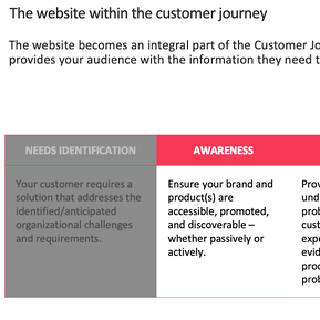
The purpose of a website within a B2B customer journey has evolved - demanding evolved content to satisfy growing demands.
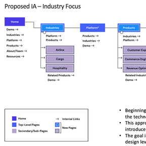
Building the site begins with the basics
Starting with IA, organization is key for scalability beyond a launch. Through this, we force the marketing teams to think of their place in the wider ecosystem.
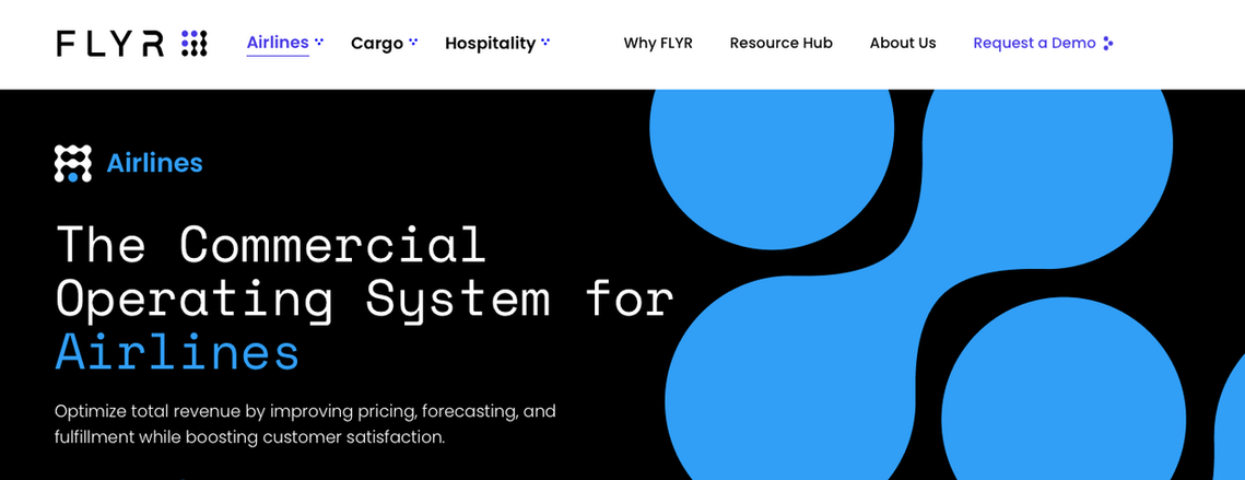
With this foundation, the team was able to quickly translate the core brand elements into a digital extension that shared not only the evolution of the brand as a new force in the Revenue Management Platform arena, but also allowed for the continued growth of industry within this solution space.
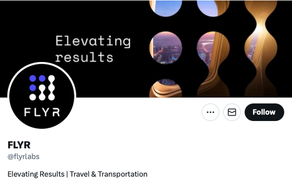
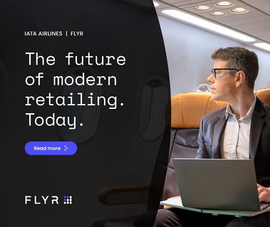
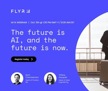
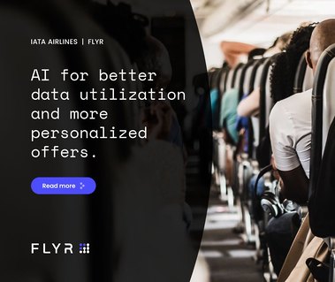
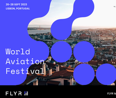
Building out the assets for a proper launch across X (Twitter) and LinkedIn were the next steps to announcing the new brand and services.


The results
Five months.
From kick-off to site launch, learning each stakeholder's unique approach to information allowed us to personalize and align with incredible speed and accuracy.
Marketing unification.
The foundation of the brand has gone on to serve as the instruction manual not only for evolution of existing products, but the template for building additional industry offerings.
Design scalability.
At each process element, we forced a perspective of not only delivering today but understanding the future and ensuring we built no "islands" to allow the brand to continue to evolve.